Basic connectivity analyses
Getting connectivity information for a set of neurons is pretty straight forward. You can get connectivity tables, edges between neurons, connectors between neurons. Make sure to check out the API.
In this example, we will focus on fetching and visualising basic connectivity data. Check out the advanced tutorial for e.g. compartmentalizing connectivity.
[1]:
import pymaid

# Initialize connection
rm = pymaid.connect_catmaid()
INFO : Global CATMAID instance set. Caching is ON. (pymaid)
Let’s start by fetching a connectivity table for some olfactory projection neurons:
[2]:
pns = pymaid.get_skids_by_annotation('glomerulus DA1 right excitatory')

cn_table = pymaid.get_partners(pns)
cn_table.head()
INFO  : Fetching connectivity table for 8 neurons (pymaid)
INFO  : Done. Found 134 pre-, 710 postsynaptic and 0 gap junction-connected neurons (pymaid)
[2]:
| neuron_name | skeleton_id | num_nodes | relation | 2863104 | 57381 | 61221 | 57353 | 57323 | 755022 | 27295 | 57311 | total | |
|---|---|---|---|---|---|---|---|---|---|---|---|---|---|
| 0 | AV4 [LH.R] 1803749 CH RJVR Vegito - check | 1803748 | 6394 | upstream | 10 | 3 | 8 | 4 | 21 | 17 | 7 | 8 | 78.0 |
| 1 | LHAV4a4#2 1853424 Accursed RJVR - check FML | 1853423 | 10266 | upstream | 7 | 6 | 6 | 4 | 12 | 18 | 6 | 8 | 67.0 |
| 2 | AV4 [LH.R] 1095415 ARH RJVR Static | 1095414 | 3983 | upstream | 5 | 2 | 9 | 1 | 9 | 16 | 12 | 9 | 63.0 |
| 3 | LHAV4a4#1 1911125 FML PS RJVR | 1911124 | 6969 | upstream | 8 | 0 | 4 | 2 | 4 | 4 | 7 | 3 | 32.0 |
| 4 | APL 203841 MR JSL | 203840 | 144725 | upstream | 4 | 0 | 6 | 2 | 2 | 3 | 2 | 4 | 23.0 |
This table is similar to the connectivity table in CATMAID: each number-column (e.g. 755022) represents connections from/to the neuron with that skeleton ID.
Since this is a pandas DataFrame, we can work pandas magic to subset it:
[3]:
downstream_only = cn_table[cn_table.relation == 'downstream']

strong_only = cn_table[cn_table.total >= 10]

large_only = cn_table[cn_table.num_nodes >= 2000]

connected_to_all = cn_table[cn_table[['755022', '2863104', '27295', '61221', '57353', '57323', '57381', '57311']].min(axis=1) != 0]
Make sure to also check out pymaid.get_partners() documenation too.
Quick visualizations
As example for a quick visualization, we will use the excellent library seaborn to plot a heatmap of an adjacency matrix.
First, get the adjacency matrix between our projection neurons and their strong downstream partners:
[4]:
adj_mat = pymaid.adjacency_matrix(pns, downstream_only[downstream_only.total >= 10])
adj_mat.head()
[4]:
| targets | 1811442 | 1911124 | 1870230 | 1803748 | 488055 | 1853423 | 6762450 | 1812558 | 1095414 | 1796364 | ... | 1812057 | 9719560 | 60445 | 1415926 | 9271871 | 424553 | 3828811 | 10331589 | 4205169 | 55153 |
|---|---|---|---|---|---|---|---|---|---|---|---|---|---|---|---|---|---|---|---|---|---|
| sources | |||||||||||||||||||||
| 2863104 | 30.0 | 23.0 | 5.0 | 15.0 | 15.0 | 12.0 | 18.0 | 6.0 | 8.0 | 0.0 | ... | 1.0 | 0.0 | 2.0 | 0.0 | 0.0 | 0.0 | 0.0 | 0.0 | 10.0 | 10.0 |
| 57381 | 4.0 | 9.0 | 28.0 | 7.0 | 0.0 | 3.0 | 0.0 | 3.0 | 1.0 | 36.0 | ... | 1.0 | 0.0 | 1.0 | 0.0 | 0.0 | 0.0 | 0.0 | 10.0 | 0.0 | 0.0 |
| 61221 | 26.0 | 13.0 | 7.0 | 13.0 | 15.0 | 15.0 | 4.0 | 4.0 | 16.0 | 0.0 | ... | 1.0 | 0.0 | 1.0 | 1.0 | 0.0 | 0.0 | 0.0 | 0.0 | 0.0 | 0.0 |
| 57353 | 3.0 | 6.0 | 23.0 | 3.0 | 3.0 | 5.0 | 4.0 | 5.0 | 5.0 | 0.0 | ... | 0.0 | 0.0 | 5.0 | 0.0 | 10.0 | 10.0 | 10.0 | 0.0 | 0.0 | 0.0 |
| 57323 | 20.0 | 15.0 | 7.0 | 22.0 | 11.0 | 19.0 | 15.0 | 18.0 | 9.0 | 26.0 | ... | 3.0 | 0.0 | 0.0 | 2.0 | 0.0 | 0.0 | 0.0 | 0.0 | 0.0 | 0.0 |
5 rows × 176 columns
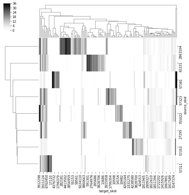
Now we will use seaborn’s clustermap to visualize this adjacency matrix:
[5]:
import seaborn as sns
import matplotlib.pyplot as plt

cm = sns.clustermap(adj_mat,
                    cmap='Greys')

plt.show()
Network analyses
pymaid and navis come with a few tools to analyse connectivity, like navis:navis.cluster_by_connectivity() or pymaid.predict_connectivity(). If you are looking to run some proper network analyses, there is no need to reinvent the wheel though: networkX will most likely do the trick.
[6]:
import networkx as nx
import navis

# Turn the adjacency matrix into a networkX Graph
g = navis.network2nx(adj_mat)

# As example: get the degree centrality for each node
dc = nx.degree_centrality(g)
print('Node centrality for some of the nodes in the network:', dc[755022], dc[2863104], dc[27295])
Node centrality for some of the nodes in the network: 0.9617486338797814 0.9617486338797814 0.9617486338797814
Have a look at the available algorithms in networkX.
Exporting connectivity
There are several excellent tools out there to visualize and analyze connectivity graphs outside of the Python ecosystem. Here, we will demonstrate how to export connectivity to formats that you can import somewhere else.
We can use g, the networkX Graph we created above, to export the graph to all kinds of different formats.
For demonstration, let’s export to the GraphML format which is widely used.
[7]:
nx.write_graphml(g, 'graph.graphml')